Crafting Accessible Web Experiences with Modern HTML
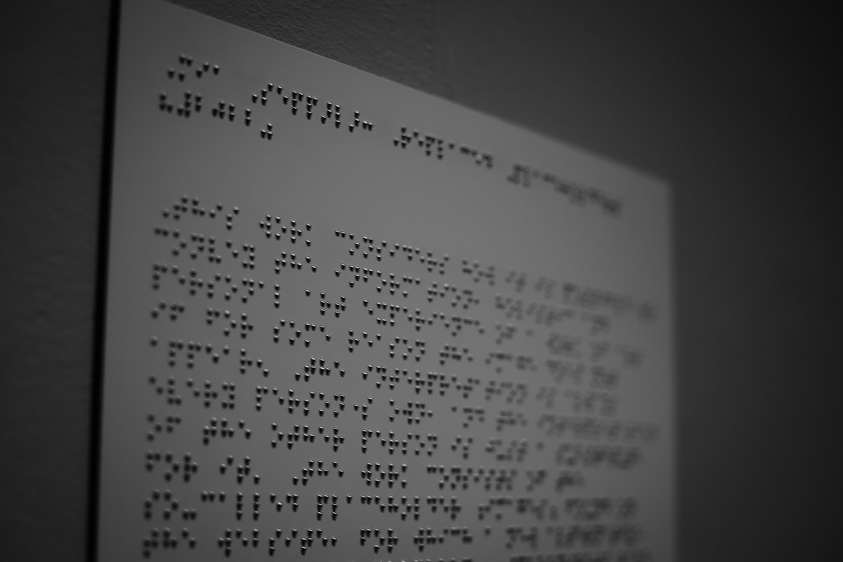
Accessibility is often treated as a compliance checkbox added at the end. Built in from the start, it produces sites that are faster, more robust, better for SEO, and usable by everyone, including the roughly one in six people living with a disability.
Table of contents:
Semantic HTML is the foundation
Many accessibility problems are solved for free by using the right element. A real button is focusable, keyboard-operable and announced correctly by screen readers. A div with a click handler gains none of that until you reimplement all of it by hand. Native nav, main and header elements, headings in order, and properly labelled forms give assistive technology a clear map of the page at no extra cost.
Semantic markup is also what search engines and AI answer engines parse to understand your content, so the same structure that helps a screen-reader user helps you rank. Accessibility and SEO are the same discipline viewed from two angles.
There is a clear business case alongside the moral one. Accessible sites reach a larger audience, tend to convert better because they are clearer to use, and reduce legal exposure under standards such as the WCAG guidelines and the regulations that reference them. Search engines reward the same clean structure that assistive technology relies on, so the effort you invest for accessibility repays itself several times over across usability, reach and ranking.
Use ARIA sparingly and correctly
The first rule of ARIA is to avoid it when a native element will do. When you genuinely need it, for a custom combobox, a tab set, or a live region announcing asynchronous updates, apply the established patterns exactly. Incorrect ARIA is measurably worse than none, because it overrides what the browser already knew and can leave a control unusable.
- Give every interactive control an accessible name through a label, aria-label or aria-labelledby.
- Use aria-live regions to announce changes that happen without a page load.
- Manage focus deliberately when opening modals, drawers and menus.
Keyboard and focus management
Everything achievable with a mouse must work with a keyboard alone. Tab order should follow the visual flow, focus states must stay clearly visible, and interactive widgets should respond to the expected keys, such as Escape to close and arrows to move within a menu. When a modal opens, focus should move into it and remain trapped there until it closes.
A quick, honest test is to put the mouse away and complete your key journeys with the keyboard only. The friction you feel is the friction real users live with every day.
Colour, contrast and motion
Text needs a contrast ratio of at least 4.5 to 1 against its background, or 3 to 1 for large text, to meet WCAG AA. Colour should never be the only way information is conveyed, so pair it with text or icons for colour-blind users. Respect the prefers-reduced-motion setting so parallax and scroll animations calm down for people who experience motion sickness or vestibular disorders.
These constraints are not creative handcuffs. A high-contrast, motion-considerate design reads more clearly for everyone, including a fully sighted user glancing at a phone in bright sunlight.
Accessible forms, media and dynamic content
Forms are where accessibility most often breaks down. Every field needs a visible, programmatically associated label, related fields belong in a fieldset with a legend, and errors must be announced and tied to the field that caused them rather than shown only as red text. Inline validation should update an aria-live region so a screen-reader user hears what changed the moment it changes.
Media carries its own obligations. Video needs captions, audio benefits from a transcript, and any animation that conveys meaning needs a text alternative. Images that inform require descriptive alt text, while purely decorative images take an empty alt attribute so assistive technology skips them cleanly. Getting this right also feeds directly into image search and SEO.
Single-page applications introduce a subtler problem. A route change updates the view without a full page load, and by default a screen reader announces nothing. Move focus to the new view's heading on navigation, update the document title, and announce the change through a live region, so moving through the app matches what sighted users experience.
Test with real tools and real people
Automated checkers such as axe or Lighthouse catch perhaps 30 to 40 percent of issues. They are invaluable, and they are only the starting point. Combine them with manual keyboard testing and, ideally, testing with real screen-reader users on NVDA, JAWS or VoiceOver. The gap between passing an automated audit and being genuinely usable is where real accessibility lives.
We build accessibility in from the first line of markup on every project, because it costs little when done early and pays back across usability, reach and ranking. See how we approach web and software engineering, or get in touch to make your product usable by everyone.